Showing posts with label art tips. Show all posts

Friday, May 24, 2013

344/365: Digital Inspiration Albums


I have been up to some creative color scheming and texture collecting this year! Tonight I took some time to sort through the goodies I've gathered. Color, texture, line, pattern...when these things catch my eye, I have to capture them. I snap photos on my iPhone and later scroll through my camera roll to get ideas for my art. It's a digital inspiration album. I use photo collage apps, like Pic Stitch, to work out new color schemes or create an eclectic design board for a project.

I haven't gone too deep into my study of design elements, but I know what I like. I know what stops me dead in my tracks to capture a "swatch" for use in my art. I know what inspires my mixed media collages. This has been such an integral part of my creative process.


My pup, Banjo, is a perfect photo walk partner and if it weren't for him I probably wouldn't have such a great collection of color swatches or texture and pattern samples. We are surrounded by inspiration in our environments, both in nature and in the man-made world. Paying attention to what draws us in can help us to develop an eye for design and our own artistic style.

Go for a walk today. Bring your camera and see what catches your eye!

Friday, March 29, 2013

288/365: Reverse Canvas Shadow Box

Today I created:

art backwards...

I have an idea for a piece of art that's going to do some double duty. Here's a peek at phase one of the project: decorating the shadow box frame.

I used a 5"x7" framed canvas, but any dimensions will work depending on the size of your project. I used acrylic to paint the canvas all the way to the back of the frame, and then painted the wooden frame itself in a contrasting color. I decoupaged some scrap paper in the background of the frame and glued some lace to cover the uneven edges where the canvas met the wood.

My shadow box is ready for filling and further adorning (to be revealed shortly). This is a unique spin on DIY canvas art. The shadow box can display a smaller work of art, some 3-D collectibles, assemblage art or a scrapbook style photo arrangement. It can be propped up to stand on a shelf or hung by attaching a ribbon. It could also be used as a fancy little table top tray.

The possibilities are endless for this simple craft project! You just need to reframe your thinking ;)

Monday, March 11, 2013

270/365 Overcoming Blocks

Today I made:

progress on a painting...

Yes, this is the sketch-turned-painting from the other day that I purposely began on a large pad of drawing paper with inexpensive craft paints in an effort to let it feel less precious. The hope was that I wouldn't become attached and stifled by the end result and the need to for it to be "just right." This is where I so often get stuck and lose momentum (and joy) while painting.

Well, perfection aside, I am growing more fond of this one with every block of color that I paint. This makes me step back and think, and start to envision what the end result could look like. This is the danger zone because now I'm not just painting for the sake of painting. I'm painting to achieve a certain outcome. I've invested enough time and energy that I'd like to be pleased with the result. Where did I get it into my head that every piece of art I attempt has to turn out well?! Silly me. I suspect that's the main reason for my blocks.

Tonight I stopped myself from continuing with my work after much deliberation. After searching through my tools for just the right brush to mimic the long, thin lines of the original sketch, I decided to wait until I had the right brush for the job. I think the outline will make this image come to life and I don't want to rush through it just to call it done. (I'm learning that from my husband's experiences in his wood shop.) I'm also battling with whether to leave it as a simple painting or to layer it up by mixing in some other media. The question, "Is it finished?" will be popping up soon. I suppose I'll just follow my urge as it gets closer to completion.

So, a slight hiccup in progress, but I do have to give myself a pat on the back for actually showing up and doing the work. It has been a while. Even though I've come up on the same old block mid-process, the sly trick of beginning with less precious materials did get me off to a strong start, rather fearlessly I might add.

I will learn to outsmart my inner critic yet!

Saturday, March 9, 2013

268/365: Room to Grow

painting in progress, 18"x24" on paper
Today I made:

sweeping strokes...

I stopped by the office supply store this afternoon to pick up some things for school, and found myself in the art supply aisle where they had a poster-sized pad of drawing paper. I envisioned myself sprawled out on the living room floor sketching my heart away. The thought of this made me so happy that I bought this oversized sketchbook and made my vision come true.

I started with a line drawing. (There's that girl again!) The large space freed me up to make big sweeping strokes and exaggerated gestures. My hand had room to play. It was so much fun and I'm one step closer to making really big art!


original sketch


I liked the drawing on it's own, but I decided to see what else it could evolve into. Using less precious materials (paper instead of a canvas, and cheap craft paints instead of the pricier artist's grade acrylics) allowed me to play and experiment without expectations. I wasn't too attached to the piece. I decided that if I ruined it, I could just sketch another. The paper buckled under the wet paint and the pigments didn't cover well with the first coat, but I quite like it so far.

This might be a practice for a canvas piece, and as often as this little lady is showing up in my art, I think she may need her own series.

I'm very happy with my purchase of the jumbo drawing pad. It gives my doodles room to grOW.


Thursday, January 17, 2013

217/365: The Art of Rejection

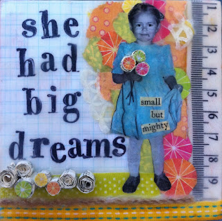
"Small, But Mighty" copyright Mila Bowman 2013
4"x4" mixed media on pine board:
encaustic (beeswax & resin), oil pastel, ink, scrap paper, 
ribbon, photo & found text
Today I made:
a recipe for dealing with rejection...

Winter got my letter! It was 71 degrees in Pacific Beach today. (That's more like it.)
That's the good news.

Today was also the day that Cloth Paper Scissors Magazine announced the finalists for the Make Mine Mini art challenge. After an extra week in limbo, I got the news. Out of 300 submissions, there were 53 finalists. I was not one of them.

A minor blow to the ego, but onward I go.
There will be more challenges, contests and submissions. It's on my bucket list to get published this year, so I'm not giving up. There had to be a first attempt and a first failure; it's part of the process. So is dealing with it...

Mila's 5 Step Plan for Dealing with Rejection Gracefully: 
1) Throw yourself a five minute pity party. (Go ahead, it's allowed.)
2) Go for a brisk walk. (My pup never rejects this idea.)
3) Eat a delicious meal. (And perhaps treat yourself to a nice glass of wine.)
4) Have a chat with a friend who makes you feel good. (Thanks, Casey!)
5) Go make more art! (That's the courageous part of the plan.)

"Small, But Mighty" is an encaustic collage of me as a wee girl. Sometimes I feel like my creative dreams are too big for me to take on, but brave Little Me knows better. She encouraged me to put my art out there for my first magazine submission. I have a wise inner child.

What I really love about this piece is the memory the photo holds. I was nearly three and still living with my mom and grandma in Poland at the time. We had taken a trip to the seashore, where at a children's club, my family convinced me to get up on stage and recite a long funny poem as part of a contest. That's me posing for a photo after winning first place. When I told my mom I was using the photo in a piece of art, she reminded me that my dress was pale blue and that my grandma clapped the loudest. 

This was a valuable experience. I got practice with my art getting judged...and rejected. It will happen and I need to learn how to deal with it. I also realized that working small is a great way to master some of the challenges of encaustic painting. Thanks to the art challenge, I now feel more comfortable exploring this medium. And best of all, I think I'm on to something with these old family photos. Maybe a series? The Big Adventures of Little Me.

I have big dreams, you know. ;)

Tuesday, January 15, 2013

215/365: First Impressions

original stamp on top left, with three stamped plaster attempts
Today I made:

field notes...

It's day three of experimenting with plaster, or my version of it- hardware store joint compound. I decided to let the "Inspire" piece simmer for a bit while I contemplate the rest of the color scheme and work up the nerve to paint a bird.

I say field notes because it's going to take some experimenting and documenting to perfect some techniques for my fun new medium, so I'm recording what worked and what didn't in my journal.

Today I spread the compound over a fresh surface, some inexpensive craft pine board. I did some more "carving" into the plaster once it set for about 15 minutes. That seemed to work best. Then I was determined to see what would happen if I attempted to stamp the surface with a rubber stamp design. My first impressions (pun intended) were not as awesome as I envisioned. It was hard to get the imprint even. Some parts didn't stamp at all and some just came up gooey. I'm not terribly disappointed with the result as it has a nice aged quality and might pair well with carving. We'll see what it looks like once I paint a wash of acrylic over it after the plaster is fully dry.

Now I get to go clean plaster out of my favorite stamp with a toothbrush. Yay.

Sunday, January 13, 2013

213/365: Hardware Store Art Supplies

Today I made:

texture with joint compound...

After last night's happy accident that resulted in peek-a-boo layers and lovely textures, I decided to experiment with a new material that would create those textures I love so much.

Picture the look of aged plaster walls. Did you know you could get the same effect using cheap hardware store joint compound? It's basically a premixed plaster that comes in little tubs. (Definitely not artist grade, but it works for me and my experiments.) I just spackled it onto sturdy canvas board with a trowel and let it dry (for several hours). Then I painted over it with a wash of acrylic (watered down paint) and the peeks and valleys picked up the paint to reveal natural texture just like I was hoping.

Here I experimented with joint compound over a page of text (you can see a little peeking through), a paper doily collaged onto the surface, and some carving into the dry plaster. So much fun! Can't wait to play more!
pieces of a work in progress

Friday, October 12, 2012

120/365: Travel Art Kit

Today I made:

a travel art kit...

Hubby and I are extending our anniversary celebration by escaping for a weekend camping/wine tasting adventure. Cell reception will be shoddy, so I may need to update my posts when I return, but the creativity will continue. I'm sure there will be countless opportunities for photography, nature inspired writings and wild forest dance-abouts, but I thought it would also be fun to bring some travel-friendly art supplies so I can get my mixed media on in the great outdoors.

Here's what's in my kit:

- camera
- art journal (I like Strathmore "visual journals" with 140 lb. cold press watercolor paper. They hold up to mixed media and come in different sizes.)
- glue stick & mini scissors (for snipping and gluing mementos)
- sketching pencils & sharpener
- PITT waterproof black India ink pens in 4 different tip sizes
- water-soluble colored pencils
- watercolor water brush (this nifty brush has a barrel that you can unscrew, fill with water and squeeze to allow water flow through the bristles. It can blend dry watercolor pencil on paper and it can lift color from water-soluble crayons or oil pastels. Perfect for travel!)

Aside from the camera and journal, it all fits in a little zipper pouch that I can tote along with me from car, to winery, to mountain hike, to tent.

Nature inspirations, here I come!

Thursday, September 6, 2012

84/365: Hanging Inspiration

Today I made:

a design line...

Still plugging away at my calendar pages. I've never had this many pieces going at once, so it's been a lesson in organization keeping them all straight. The bits and pieces of the series come together willy-nilly and I find myself sorting them and designating piles of little elements for each month of the project- a photo here, a text snippet there, a color swatch to tie it together. I invariably get an idea for another one of the pages as I work out a design or rummage through my supplies. Pretty soon my art desk is all a-clutter with ideas that I couldn't possibly take on all at once. My tiny art space does not have room for piles!

So I'm finally putting my inspiration wire- my design line- to good use. I've been clipping page notes and corresponding pieces together and hanging them on a length of chord that stretches across the wall of my art space. Things stay tidy and organized and enough out of the way, but they are within sight and reach so I can add bits and pieces to each page as I get inspired. This is essentially the same as tacking things up on an inspiration board, but my line works well for my twelve mini projects. I'm starting to see it all come together!

Wednesday, September 5, 2012

83/365: Scantastic Ways to Add Color to a Page

playing with color and texture for a calendar page;
That green paper is a scan of a vintage book cover.
Looks like fabric, doesn't it?
Today I made:

my scanner work for me...

Whether I'm creating a mixed media piece on a canvas, or working on paper to design an art journal or scrapbook layout, I'm always trying to find new ways to add color to the page. Don't get me wrong, I love me some paint and pastels, but they don't call it mixed media for nothin'! I'm also finding that commercially produced scrapbook paper can get a little boring to use all the time, so lately I've been making my own paper.

A scanner really comes in handy for this. If it can fit under the lid without damaging the glass, I've scanned it. I've tried everything from fabrics (right out of my closet), to vintage book covers, wicker baskets, wood, my hand, scrabble tiles and leaves. Textures and colors stay true when scanned; it's just a flatter version of the real thing. I tend to save actual fabrics and 3-D elements to use as embellishments, but the scanned versions work great as flat backgrounds to write on or can be torn to bits and mixed into a collage. I just have a cheap printer/scanner/copier combo and it does the trick. This is not the most efficient use of ink, but sometimes I see just the right color or pattern for a piece and can't help myself. If you don't have the paint color you need or you can't find exactly what you're looking for in that stack of store bought patterned paper, look around, inspiration is everywhere. And it can be scanned!

Tuesday, September 4, 2012

82/365: Collage Composition & Cameras

Today I made:

digital photos to help with composition...


No power tools today. I took a break for softer things; back to working on my calendar pages. Here's a sneak peek of a summer month I'm working on.


The pages are coming together much like my art journals and scrapbook pages do. A picture is often the inspiration for both color palette and text. I like to collage in several elements (paper embellishments and ephemera) while I'm designing, but sometimes it's hard to know where things should go on the page. Mostly everything I've learned about composition in collage, I've discovered through play and trial and error. There are some general guidelines to composition (that I could spout off if I had gone to art school), but I like to trust my eye. Pieces get moved around until the composition looks "just right."

One handy trick I use is to take a digital photo of a layout or composition before attaching anything to the collage surface. Then I move things around to try a different composition and take another photo. I repeat this a few times without gluing anything down until I have three or four versions of the page on my camera. Then I flip through them to see which one is the most appealing to the eye. It helps to have options to compare side by side. It's kind of like having a studio mate and asking, "Which version do you like better?" But my pup is not much help in this area, so I go it alone with the aid of my camera.  Our eyes know what pleases us.